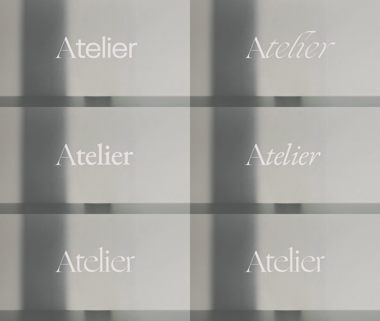
What Does Atelier Mean to you?
When I think of the word atelier, I think of a workshop, a place where an artist, designer or craftsperson works by hand, small or large scale, with exceptional care. Over centuries it grew to mean any creative workspace: the painter’s studio, the couturier’s workroom, the room where a garment is cut, basted, fitted and stitched until it’s exactly right. It became the staple of high luxury.
That’s the spirit behind this identity. Atelier evokes the quiet discipline of making: the measured line of a running stitch, the precision of a tailor’s chalk mark, the patience of embroidery worked one thread at a time. It’s craft before trend, and the hand before the machine.
Personal Work - Created on October 20th, 2026
Brand Identity
✳︎
Mood Board
✳︎
Scalable Solutions
✳︎
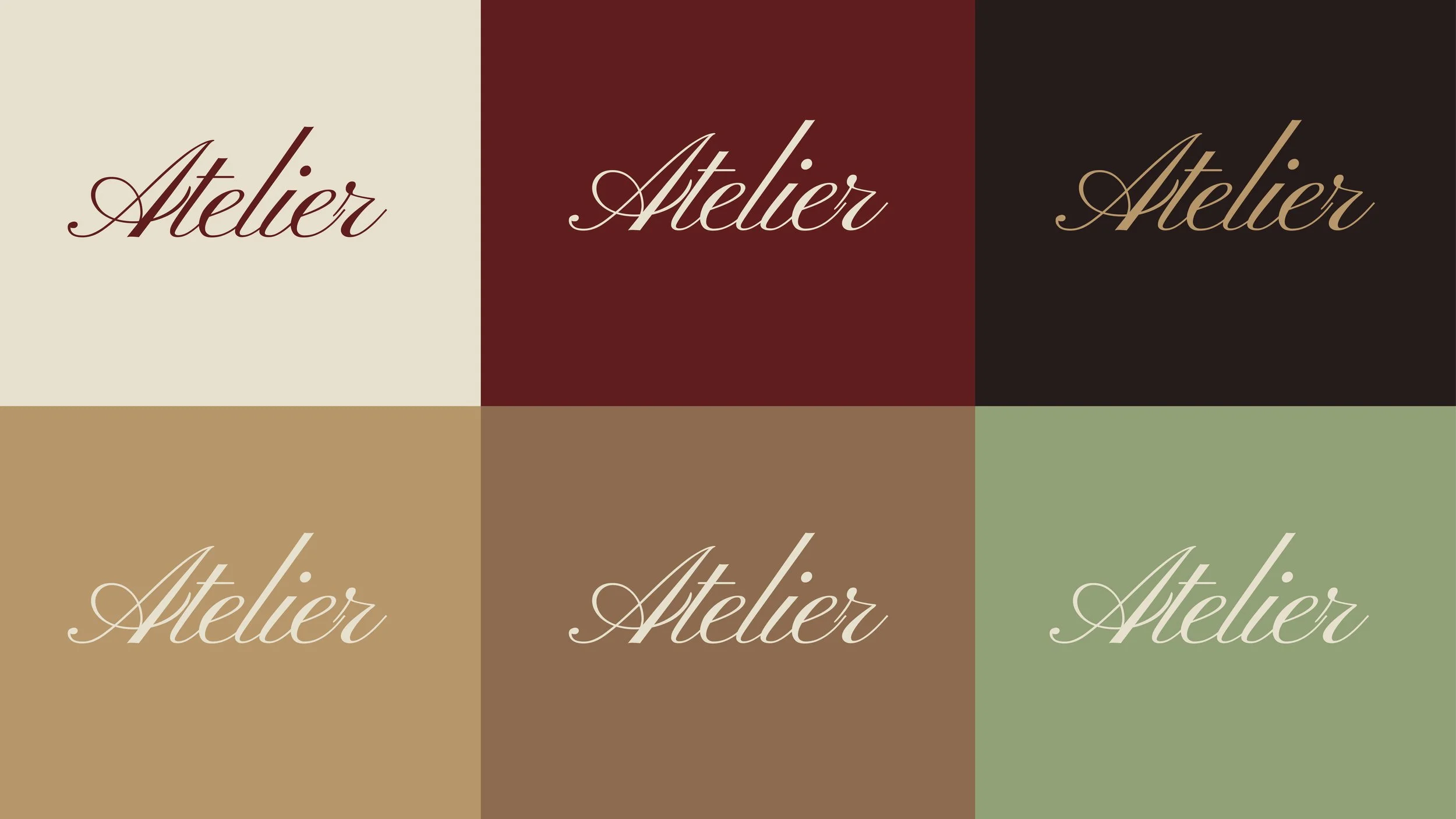
Color Iterations
✳︎
Commercial Design
✳︎
Brand Identity ✳︎ Mood Board ✳︎ Scalable Solutions ✳︎ Color Iterations ✳︎ Commercial Design ✳︎
2026
Illustration Page
Where did I start?
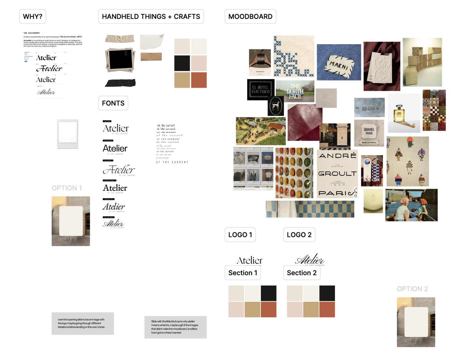
Diving into a brief, I always ask myself, what is it that we are trying to convey? Color palettes along with typography matter so much, in both a large scale and small scale project. They are the defining factor in why we do what it is we do, both designers and art directors. Alongside the mood boards & the palettes, I was very selective in the type of images and the types of animations and objects that meant something to the word “atelier.”
Below are some examples, some moods, some mockups, and everything in between!
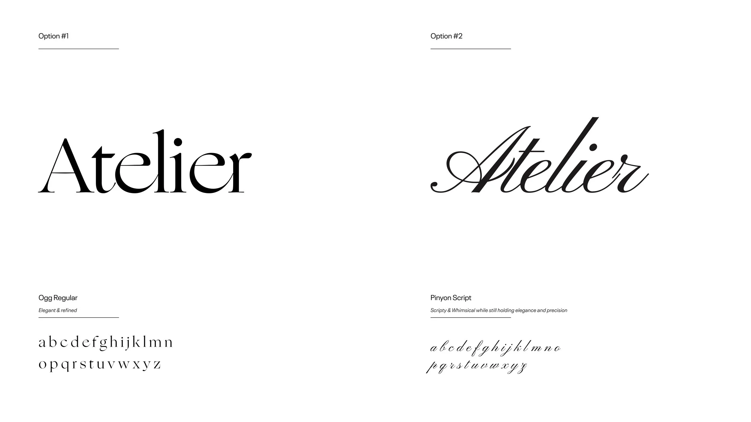
In defining the visual voice of Atelier, the identity explores the dialogue between discipline and gesture. While Ogg Regular grounds the brand in sculptural, editorial poise, Pinyon Script introduces an intimate, hand-spun romance—each reflecting a different facet of dedicated craft.
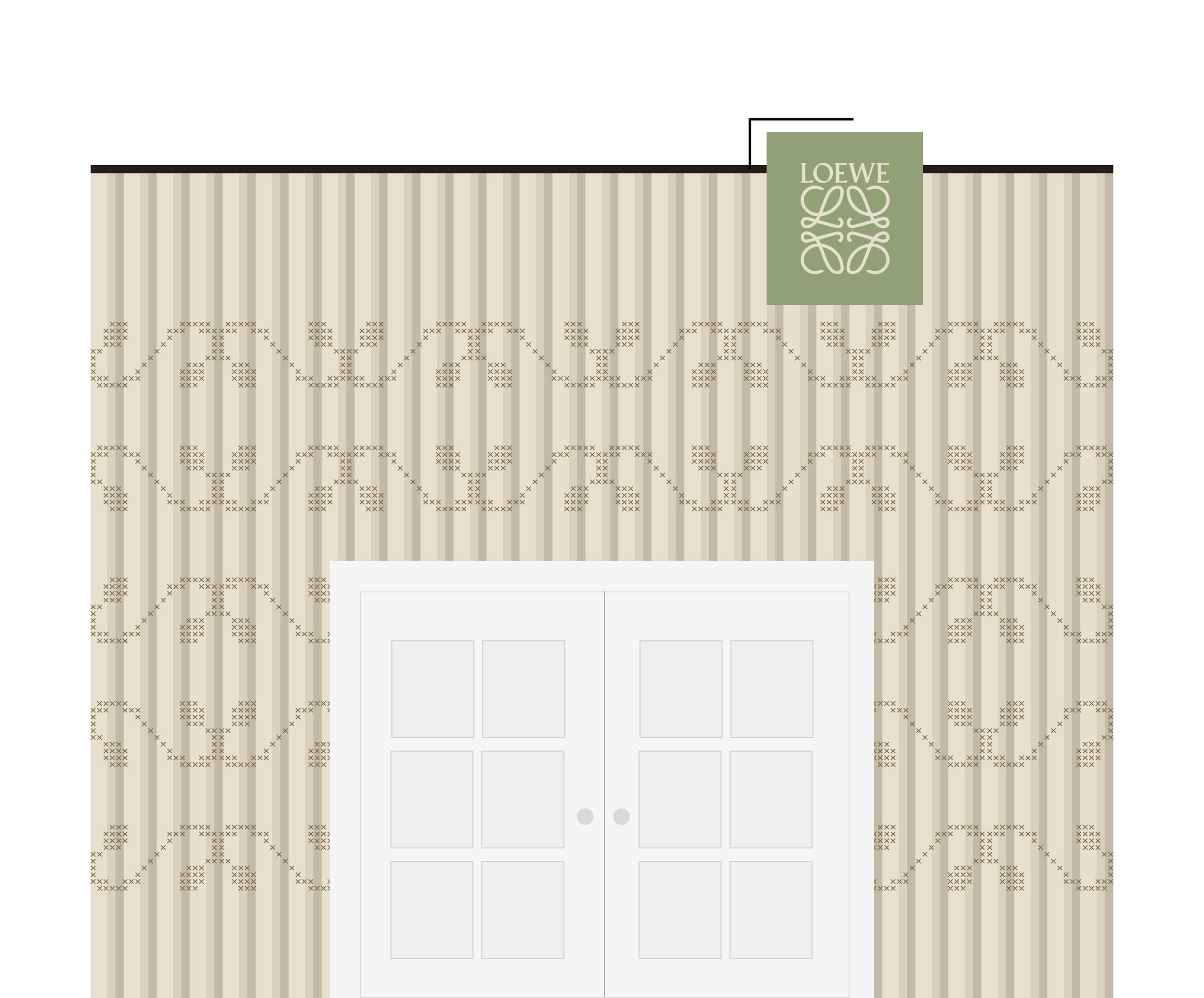
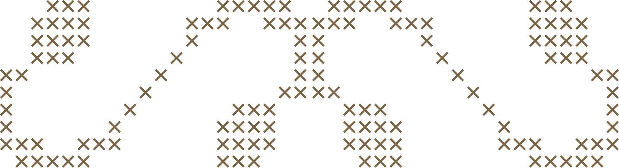
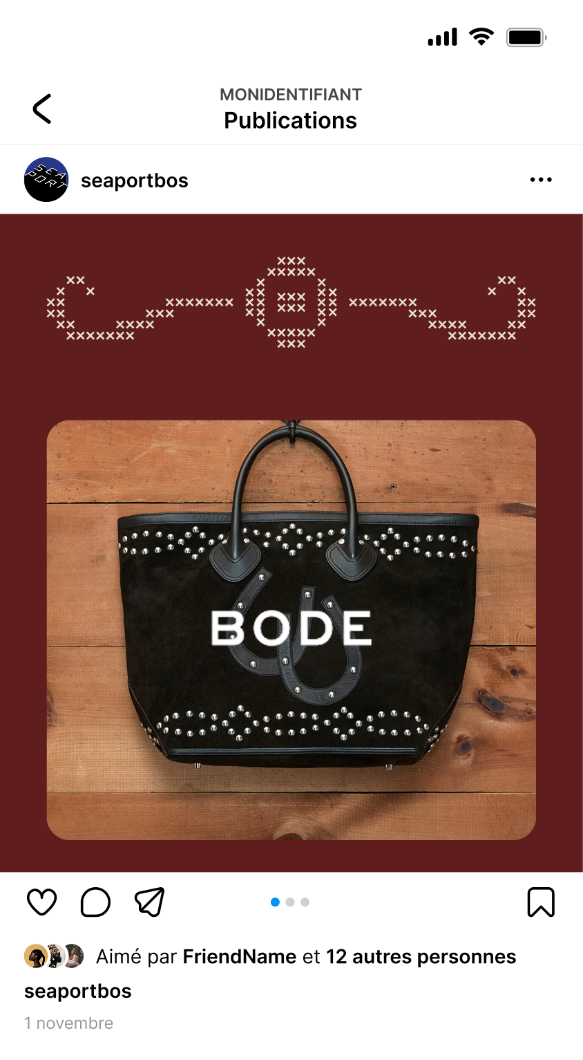
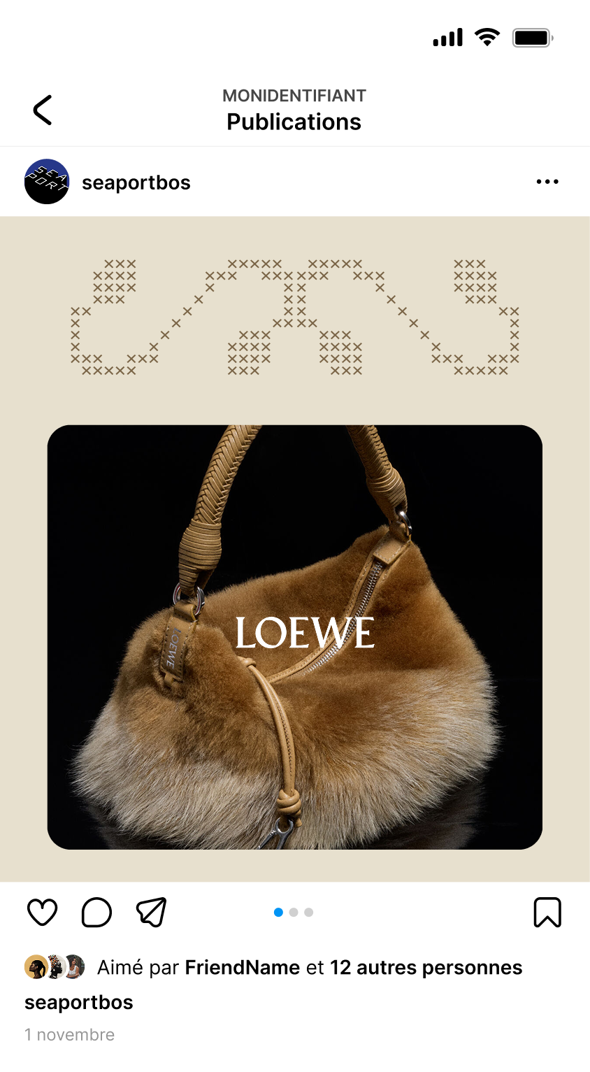
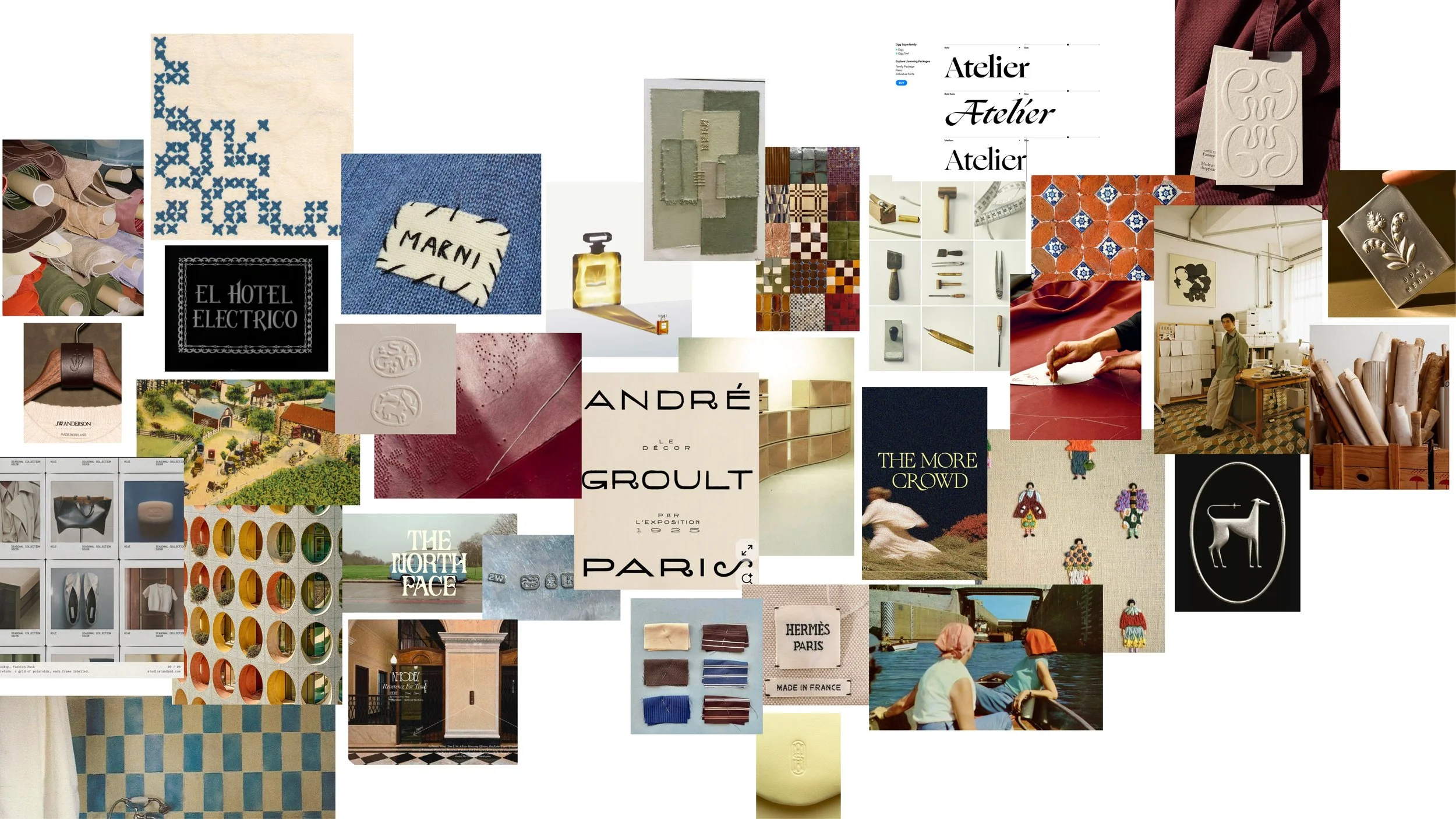
This moodboard brings together the tools, textiles and stitched details of hands-on craft, set against the refinement of Parisian maisons and heritage design. Together, they capture the balance at the heart of Atelier: the warmth of the handmade & the warmth of a new season upon us, guided by precision and quiet elegance. Something I really wanted to explore was the idea of cross stitching, many companies have used this method, in both marketing but also product ideation, it gives back to the viewer a sense of creation, and a sense of hand marking from both personal and hand woven craft. This later becomes important in how I envisioned this method impacting future designs and the way it shows up live.
Color Palette Ideation:
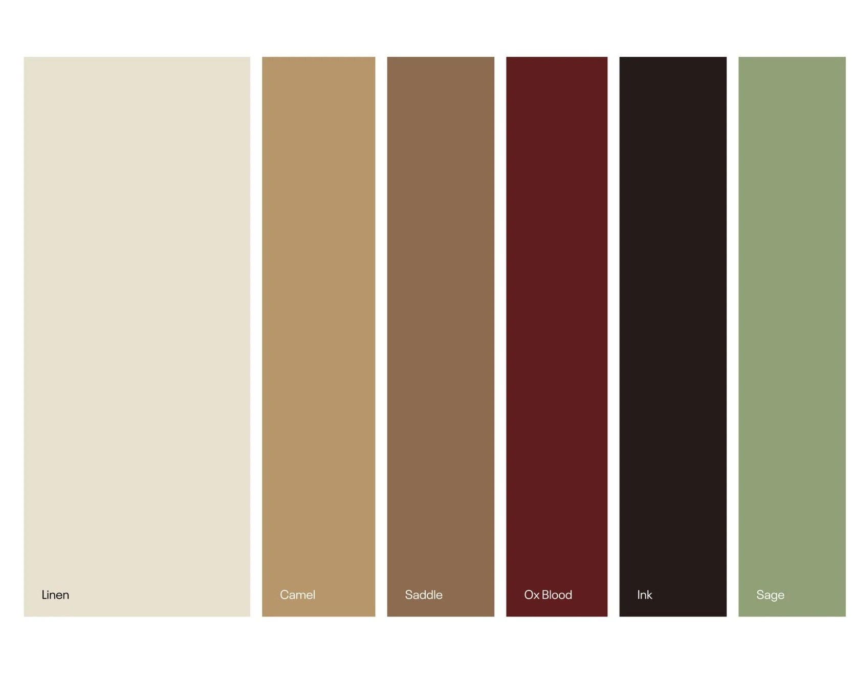
This palette feels tactile and handmade. Its warm neutrals and deep ink give the calligraphic nature a refined, quiet backdrop, carrying the same balance of craft and precision.
Keeping in mind the spring seasons, this feels like a nice transition from the winter seasons, still being subtle with hints of the fresher green and linen.
Leading with Linen as the for front.
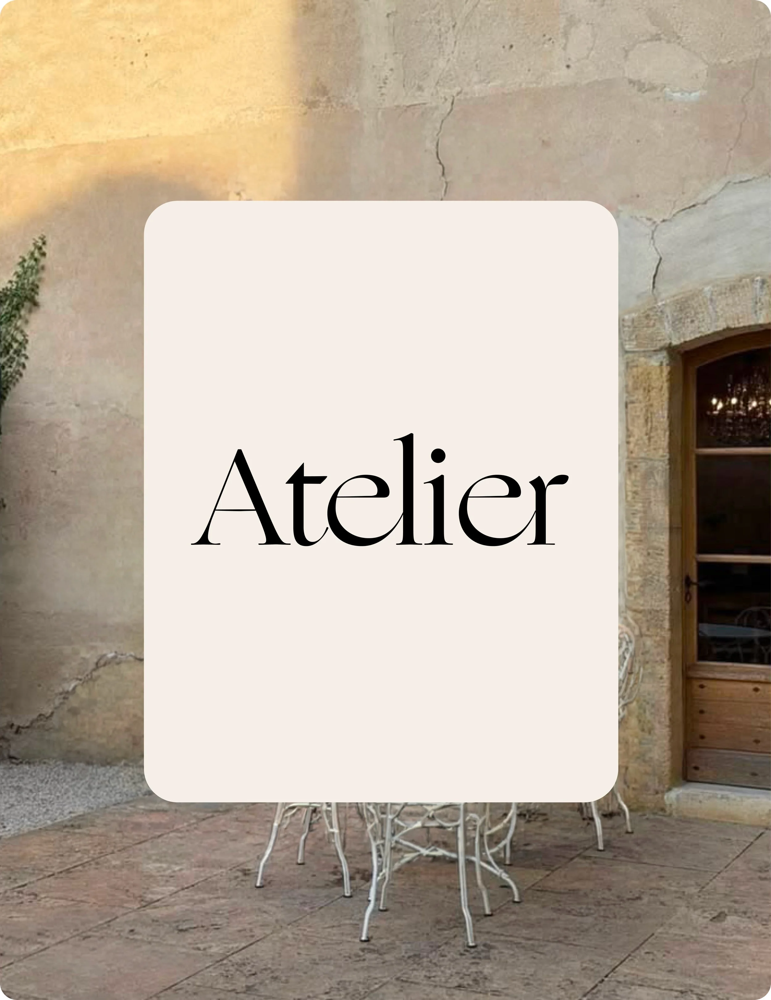
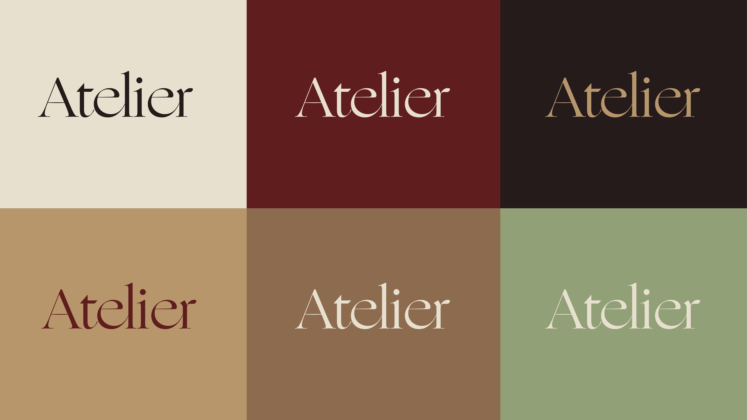
Paired with an intentional palette, the typography sharpens the identity’s visual presence while creating a cohesive foundation. The resulting color system not only refines the current aesthetic but offers a flexible framework designed to seamlessly adapt across future collections and brand extensions.
Cross-stitch embodies the atelier: each counted stitch shows precision, patience and the human hand, rooted in a tradition of learning and passing down craft. That same handwork is what gives a bag or garment its value, turning it into something one-of-a-kind and personal that people keep, cherish and remember.